Features by Type
Features
The OED system has a number of features. This page gives a brief description of the feature along with a link to the documentation pages with more information and pictures. The academic uses example page shows many of these features but focusing on how they might be used. Some people may wish to see a number of these features by using our live demo site or watching this video: 
OED acquires, permanently stores and analyzes data it receives. While this is important in allowing OED to have the features on this page, it is not normally visible to the user and is not discussed here. If you are interested in how OED does this work then please contact the project.
- OED has two types of items it displays in graphical representations of the data:
- Meters. A meter is generally a hardware device that provides information on usage. For example, it might measure electrical usage or water consumption in a building. OED aids the OED administrator in adding new meters and lets you control them via web interfaces.
- Groups. A group represents the sum of data from other meters or groups. For example, you could have a group with all the electrical meters for your organization to get total electrical usage. This allows sites to combine data however they want. For example, a college campus might have groups for each dorm, all dorms, athletic facilities, renewable generation, academic buildings, etc. Since groups can contain groups, you could use the groups for each dorm to get the total usage across all dorms rather than having to include all the meters again. The site administrator can create any desired group via a web interface so each site can do this without needing external help (or paying someone to do it). This is a unique and powerful feature of OED.
- Graphical display of data. OED currently provides four unique views of the data. In each view you can pick any meters or groups you want to include.
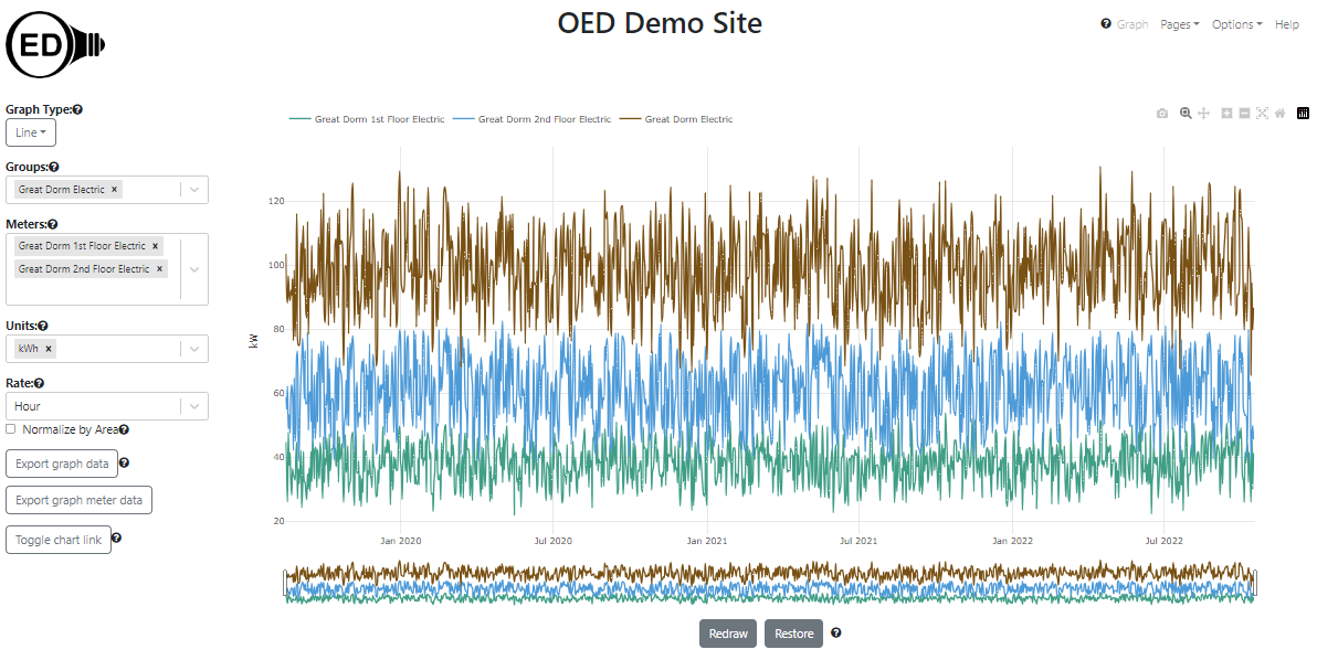
- Line Graphic. Each meter/group is represented by a line graph of usage versus time where you can control the time frame shown. An example is shown in the next figure where "Great Dorm 1st Floor Electric" and "Great Dorm 2nd Floor Electric" meters and "Great Dorm Electric" group that includes these two meters. As such, the group is the sum of the values of the two meters at each time point. value which can be verified by checking the hover value on each line (the "Great Dorm Electric" hover is shown).
One can choose any compatible graphing unit to display the data. In the following figure, the same data is displayed as cost in U.S. dollars. OED supports virtually any unit including CO2, weight, volume, temperature, power (kW, etc.) where new units can be created by a site. Every graphic support one choosing the desired unit for display.
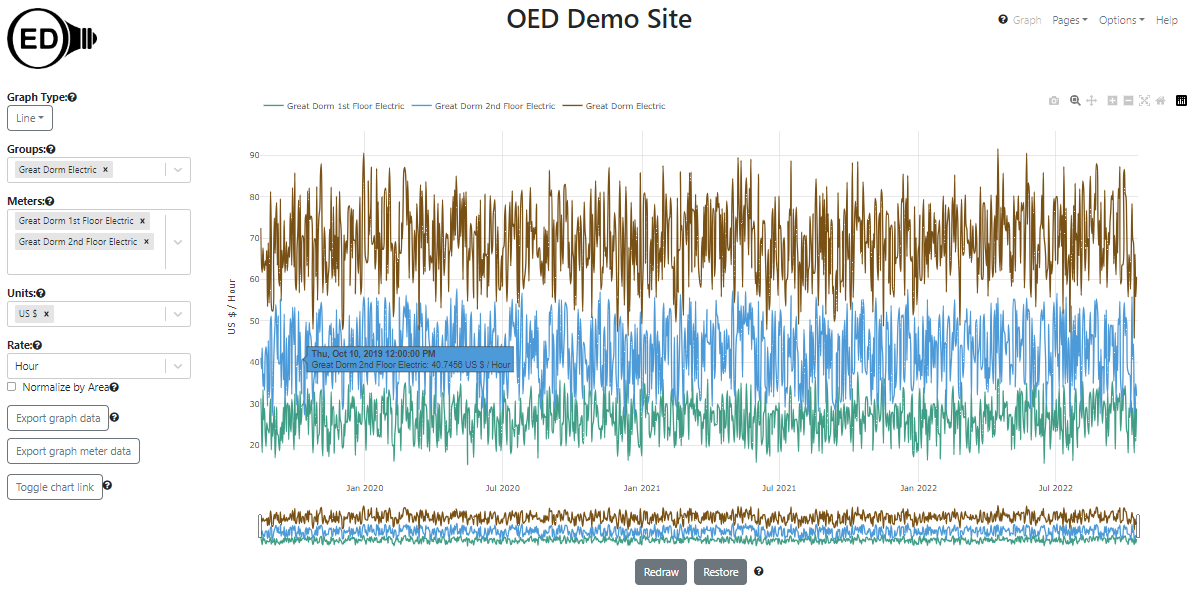
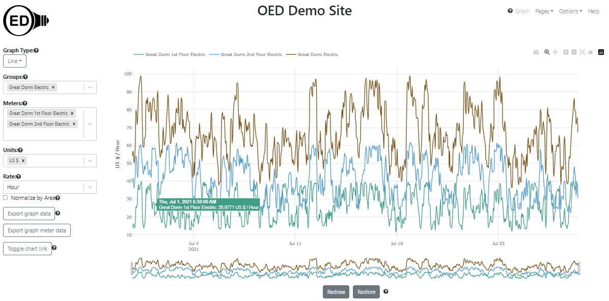
OED optimizes the time shown between points on a line graphic. This allows each point to be separate along with speeding up graphing requests while minimizing the network traffic. In the previous line graphic examples, each point represented the average usage over one day. Since there was about three years worth of data (16 August 2019 to 16 October 2022), there are 1157 days with that many points on the graphic. This is why the hover information shows 12:00:00 PM for each point because that is the middle of each day/point. While this is useful, sometimes you want to see more detail. In the following figure, the rectangles at the bottom of the graphic were dragged to contain July 2021 and the graphic was then redrawn. The hover now shows thirty minutes into the hour since that is the middle of that point that spans one hour. There are approximately 31 days * 24 hours/day = 744 hourly points in this graphic.
If you continue to zoom in on days then you will see the original meter readings. In the following figure, the dates were modified to be the first 20 days in July. The hover now shows 20 minutes past the hour because that meter reads data every 20 minutes (the reading goes from 10 past the hour to 30 past the hour on this meter). There are 20 days * 24 hours/day * 3 readings/hour = 1440 readings on this graphic.
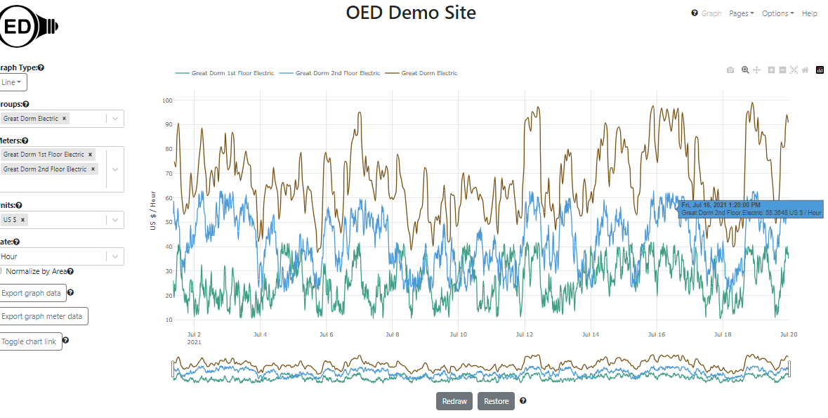
OED will give the highest quality (shortest time between points) for each meter that it can given the date range of the graphic.
- Bar Graphic. Each meter/group is represented by a series of bars over the total time chosen showing the total usage over the chosen number of days for each bar. An example of four weeks is shown in the next figure for the same meters/group for the line graphic. It is for kWh where the date range selected was for all of 2021 so there are 52 weeks / 4 weeks/bar = 13 bars. Again the group is the sum of the two meters.
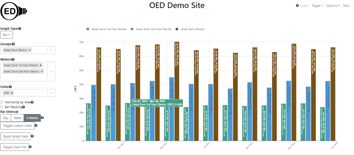
There are several bar graphic options. One allows for predefined day, week and 4 weeks bars or one can select between 1 to 365 days if those are not desired. You can also stack the bars rather than having them next to each other for each date range shown.
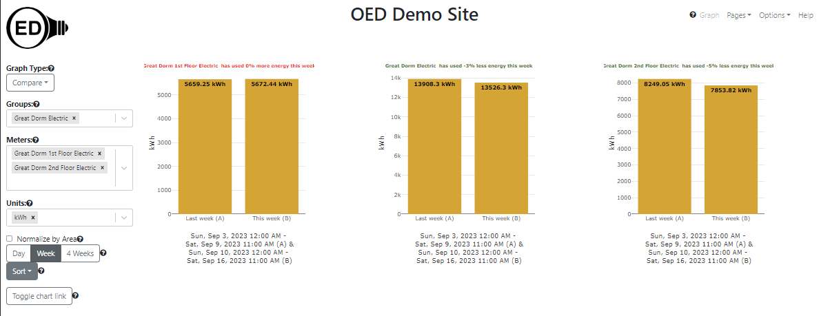
- Compare Graphic. Each meter/group is represented by its own bar group comparing the current usage to the previous usage over day, week or four weeks. OED supports sorting the graphs alphabetically and by how much they improved between the current and previous time period. Typically this graphic is used to see how usage is changing and to compare between different areas of an organization. For example, on a college campus one could run an energy competition to see how each dorm is doing in saving energy. The following figure shows the running example in kWh comparing the current week to the previous week. It is sorted from the meter/group with the least improvement to the one with the best improvement. The title of each graphic is colored coded so it is green when using less energy was used in the current time vs the past time and red if using more/same. Note the scale of the y-axis varies by meter/group but the sum of the bars for the two meters equals the group.
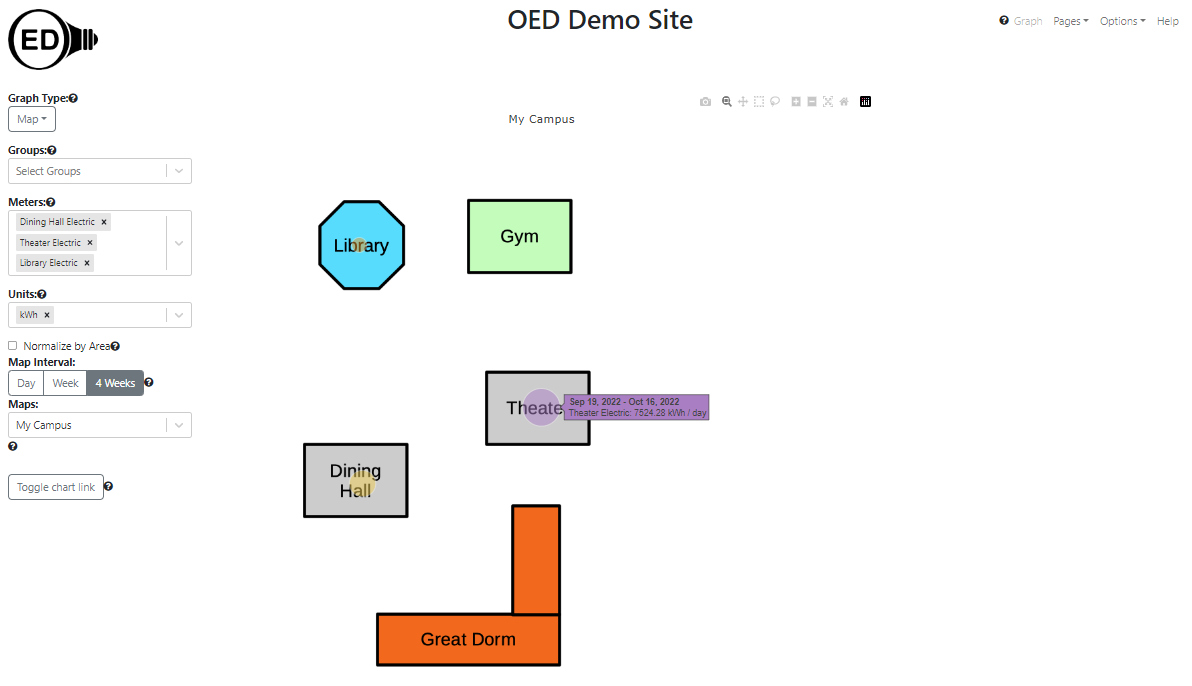
- Map Graphic. Each meter/group is represented by a circle on a map where the size of the circle represents usage per day for the range selected (day, week, 4 weeks). This representation is useful in getting a visual sense of how much energy different areas (often buildings) of an organization use. A site can have as many maps as they wish and maps can overlap (for example, a larger map with the entire organization and ones that zoom in on specific areas). The site administrator can upload any graphical image of the organization and they use a web interface to define GPS coordinates for all meters/groups. This requires no additional software nor knowledge of GIS graphing. The following figure shows the electric usage in kWh of four different buildings over four weeks. Three of the buildings use meters for the entire building and the forth uses a group since each floor of "Great Dorm" has a separate meter. The hover shows the actual value that the circle represents.
- Area normalization. Because the area covered by a meter or group can vary greatly, the absolute usage can be misleading. To help, OED allows for normalizing the usage by the area represented. The following figure shows the electrical usage in BTU (showing you can display in any energy unit because the meters collect this information in kWh). The Theater uses the most electricity then the Dining Hall and the least by Great Dorm.
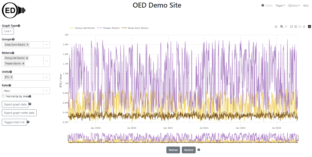
In the next graphic, the option to "Normalize by Area" is selected. Note the y-axis units are now "BTU / Hour / sq. meters". The area of the the Theater is 10,000 sq. meters, the Dining Hall is 1,000 sq. meters and the Great Dorm is 10,000 sq. meters. Thus, when normalized by area, the Theater is substantially below the Dining Hall because it is 10 times larger. There is no change between the Theater and Great Dorm because they are the same area. Clearly the Theater is either used differently or is much more efficient compared to the Dining Hall.
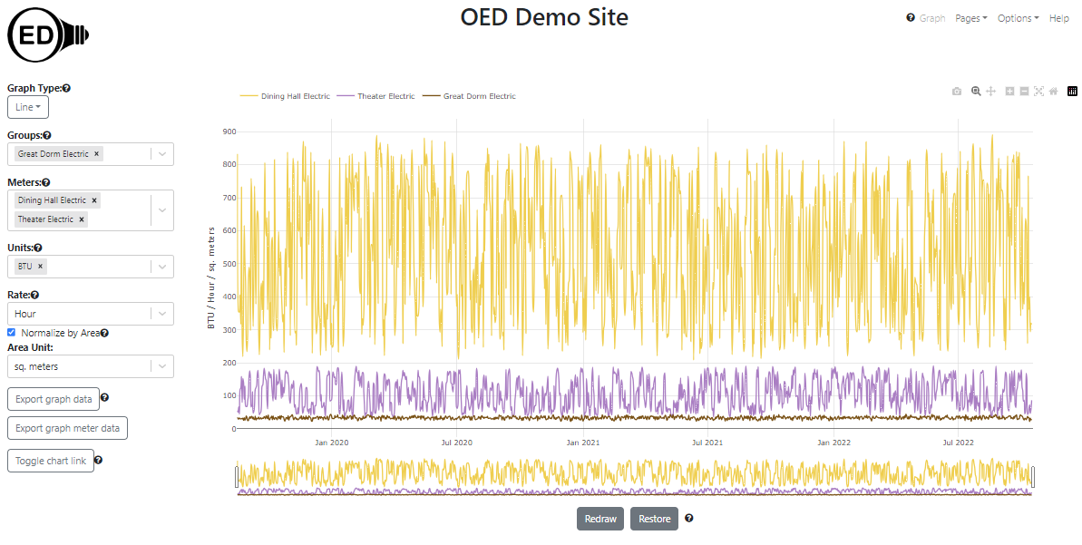
One can normalize by either sq. meters or sq. feet independent of the area unit for a meter/group.
- Data Export. You can export the data of the line and bar graphics which includes all meters and groups for the specified time frame of the graphic. This means you can use OED to inspect the data, including its ability to sum data into groups, and if you decide you would like to work on that data outside OED you simply click a button. This also gives you the ability to export all meter data that resides in OED for a full data dump. OED feels you should always have easy access to your data from the web pages. After all, it is your data. OED believes in being open in many ways.
- Hiding Options. OED is designed to work on any reasonable device from a cell phone to large monitor. If you are on a small screen or a monitor that is not interactive, you might want to only have the graphics on the screen. You can hide the options normally shown on the page so they are docked in the top, left corner where popup menu gives access to all the OED controls that were docked.
- Chart Links. Sometimes you want to post a specific graphic from OED so others can easily see it. For example, you might want to have a link on your website to let the public easily see how you are reducing your energy usage. You also might want to easily get back a graphic that is interesting and took time to produce. For any graphic, you can click a button to get a URL that you can either use as a link in a website or put into the address bar in your web browser to recreate that graphic. While the same graphic is reproduced, you are in a full featured version of OED so you can continue to interact with the system as you wish. To support public monitors without interaction, the link has an option to hide the menus.
- Meter and Group Viewing. There is a page to see details on meters and another for groups. This allows users to see information about the data they are graphing. If you are an administrator of the site then you can use these pages to create new groups and edit the information for a meter or group.
- Tooltip help. OED has help throughout the web pages to give users context sensitive help that is linked to the OED documentation web pages.
- Admin pages. OED believes that a non-IT person should be able to set up a site and control the site with just a web browser. OED provides web pages to control many aspects including meter, group, unit, conversion and map creation and editings, site language, default graphic shown and the site name. There are also features to allow admins to input new meters and manually add meter data via a CSV file.
- OED has an interface that allows acquisition of data from many sources. At the current time we can automatically accept data from Obvius AcquiSuite, which can collect data from many meter types, MAMAC meters and eGauge meters. OED can also accept meter data or the creation of new meters via a CSV file either through the admin web pages or the internet. The CSV upload allows for loading historical data as well as sending data from other devices where the data can be placed in a CSV file. If the current methods for acquiring meter data do not meet your needs, you can produce code to have OED accept the new meter format through our API or contact OED to see if we will do the necessary modifications.
- Easy site installation via the Docker containerized system. The automated installation process takes care of all needed software. It also isolates OED from other software running on your system so it should not impact other applications on your server.
- A site can change the default language displayed on all web pages. OED currently supports English, Spanish (Latin American variation) and French. (Some newer parts, such as the help system, are awaiting translation from English.) The user can also choose the preferred language. Any site wishing to add an additional language should contact us. Once the list of phrases used is translated, we can easily include them in OED.
- OED has the ability to send the site administrator a regular email to inform them of any issues OED has encountered including failures to acquire meter data.
- OED supports sites using HTTPS (encrypted) connections.
- Unlike some energy dashboards, OED is designed to allow users to interact with the data. If the dashboard takes significant time to respond then the user will not want to use interactive features. OED has invested significant effort in making the system very responsive by sophisticated data management techniques and limiting network transfers. Our goal is sub 1 second response times.
- OED is based on modern, free, maintained and reliable software. This means OED will be a viable dashboard for many years to come while still supporting current and future computers, cell phones, etc.
- OED is constantly maintaining and enhancing our dashboard. We actively encourage any type of user to report issues or ideas for enhancements to OED. We are driven by the user community and their input decides the directions we go in.